

One Good AI Image Is Worth Almost Nothing
Your AI images may already look polished. But if each one uses a different visual language, people will not recognize them as yours.
You rewrote the prompt five times. The banner is done, the posts are done, and the blog header is done. Then you line them up, and something sinks a little. They may look professional, but they do not yet look recognizably like your brand.
Pay attention to that feeling. It’s telling you something true.
A good image used to be hard to make. Now any AI tool gives you one almost instantly. And when something gets that easy, it stops being what people notice. What they notice instead is whether your images belong together. Whether the banner, the posts, and the header feel like they came from the same place.
Most people will not consciously analyze the palette. They will simply feel whether the visuals belong together. Images that fit together feel like someone cares, and that’s what people remember. Images that don’t fit feel like nobody’s home.
Color drift usually begins in the prompt. You may specify the subject, composition, and lighting, but leave hue, color balance, and color hierarchy open for the model to decide. When color is unspecified, the model fills in the gap with a plausible default. The result can look attractive, but it may not match your other visuals or reinforce your brand.
You do not need to become a color theorist. Start with one natural object and use its colors as a system.
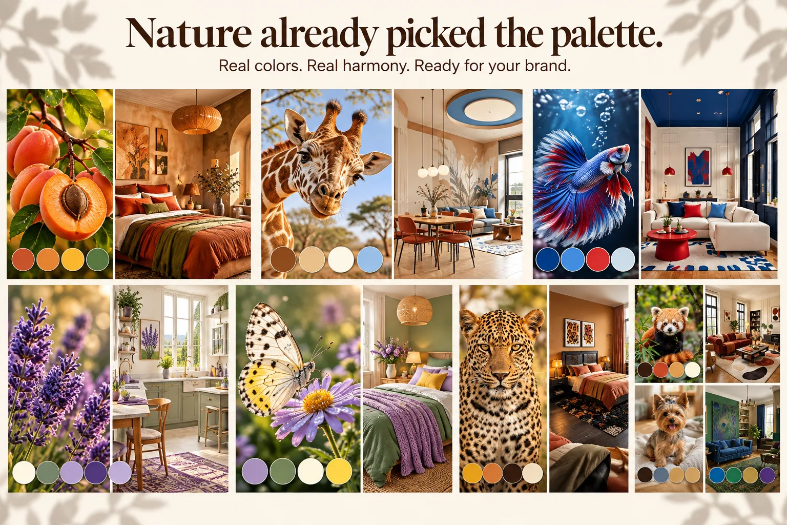
It could be a pomegranate. Or a peacock feather. Or a lavender field at sunset. Look closely at any of them, and you’ll see one color that leads, one that holds the space, and one that shows up just enough to make you look twice.
Here’s how.
- Find something in nature you’d actually want to look at. That pull you feel is your taste. Trust it.
- Pull four colors from it.
- Give each color a role. One leads, one supports, one stays quiet in the background, and one is the spark.
- Name each color the way you’d describe it to a friend. Not “green.” Olive leaf green.
- Test it on the formats you actually publish before you commit.
Below, we’ll walk through each step, show how ChatGPT, Gemini, and Midjourney actually listen to color, show how to keep the palette from drifting, and do the last check before anything goes live: whether people can read your text.
Why AI Images Drift Toward the Same Colors
When a prompt says nothing about color, the model decides. When it says “warm” or “earthy,” the model still chooses the actual hues, their proportions, and where they appear. Run the same brief through three tools, and you may get three different safe choices.
The toolmakers’ own guidance points the same way. OpenAI’s image prompting guide tells users to name colors, materials, and lighting directly and to restate critical constraints when a result starts to drift. Midjourney offers a feature called Style Reference, designed to carry the colors, textures, and lighting of one image into the next.
So the problem is rarely the tool. It is that color was never treated as a decision. If every prompt starts without a palette, every new image effectively starts a new visual system. That makes consistency difficult even when each image looks good on its own. The underlying rule is older than image models: garbage in, garbage out. A prompt without colors is not garbage, but it is missing a fact the result depends on, and a model handed an incomplete brief fills the gap with its safest guess.
Why Nature Is the Best Place to Borrow a Palette
Building a palette from scratch is hard. Picking four colors that look good together is the easy part. Deciding how much of each to use, which one carries the image, and which one only appears in small doses is where most homemade palettes fall apart.
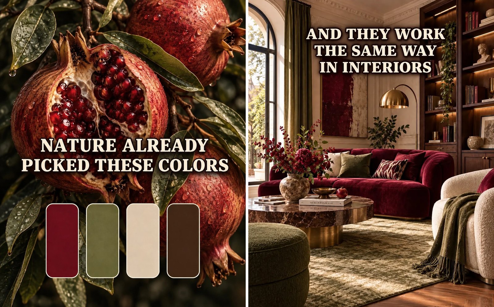
A natural reference gives you a palette whose relationships already work together visually. In a split pomegranate, deep red leads through the rind and seeds. Cream softens the space around it. Olive leaves keep the image grounded, while dark brown appears only at the edges, where it adds depth without taking over.
The value is not only in the colors themselves but also in the balance between them. Nature already gives you a sense of what should dominate, what should stay quiet, and what should appear only as a small spark.
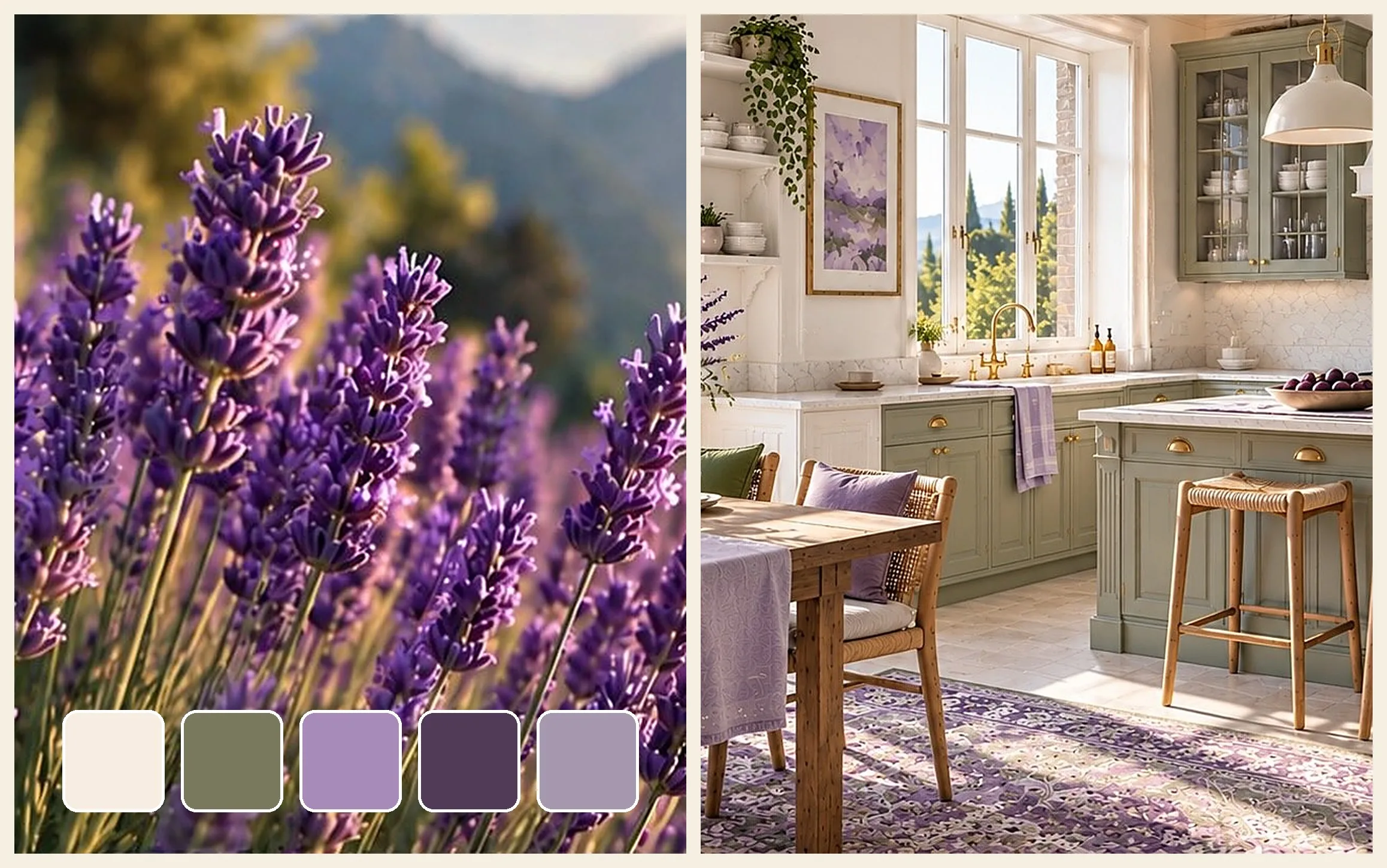
A color named after a real thing gives a model a clearer visual cue. Ideogram’s documentation on memory colors explains that visually grounded references such as “cherry red” or “sky blue” convey a color nuance far better than “red” or “blue.” Its list of recommended terms reads almost like a fruit market: pomegranate, apricot, fig, olive, and even peacock feather. When you borrow a palette from nature, you also get more specific language for describing color to image models.
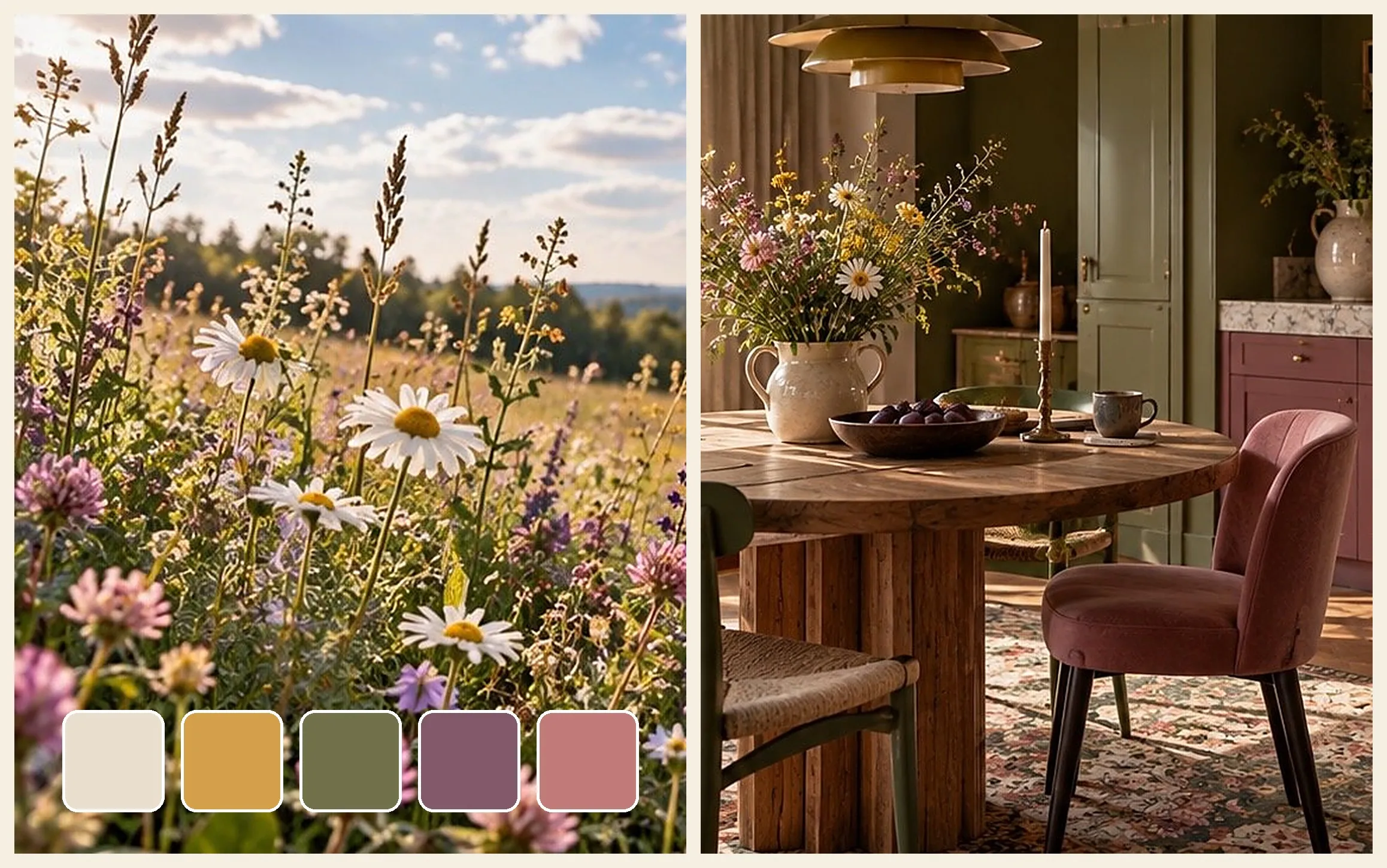
Several images in this article pair a natural object with a room in the same palette. A room is the most demanding test a palette can face, because walls, fabrics, wood, and small objects all have to agree at once. If four colors hold together across an entire room, the same roles will hold in a product shot, a social post, or a landing page hero.
How to Build an AI Image Color Palette From a Natural Object
The first palette takes a little longer. After that, it gets quick. It works for a brand that has no defined colors yet and for a brand that needs supporting colors around one fixed brand color.
Step 1: Choose an Object That Matches the Feeling You Need
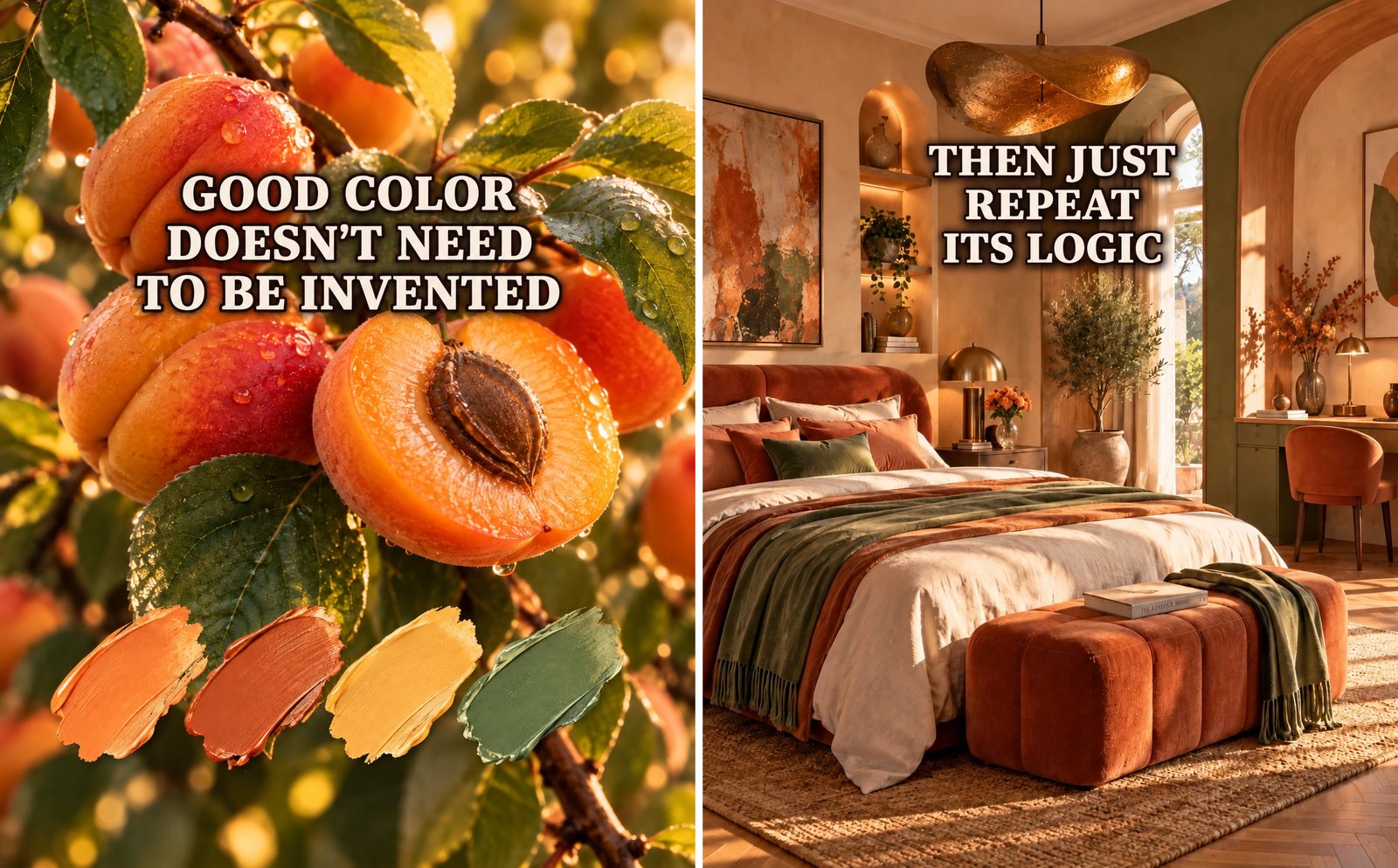
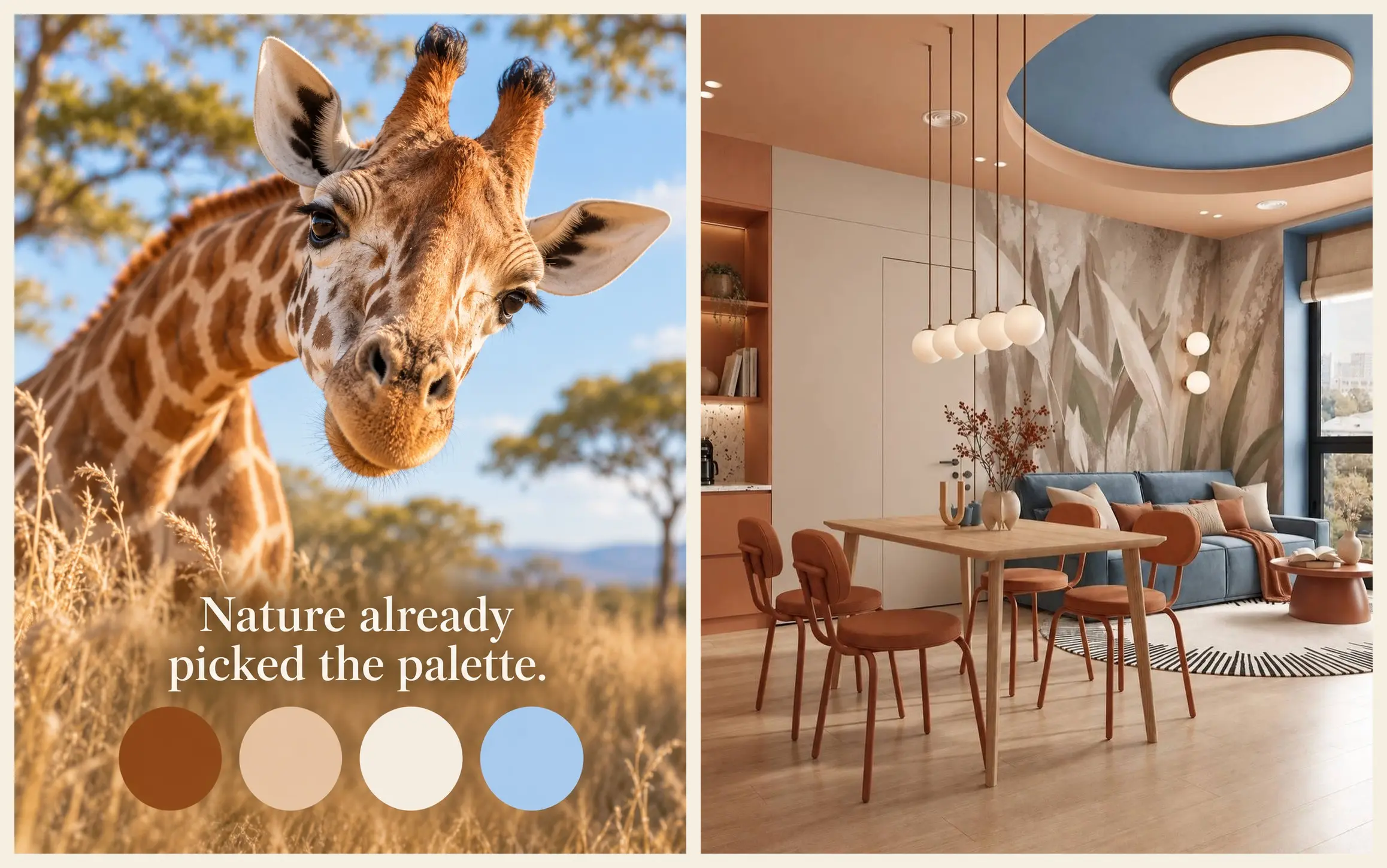
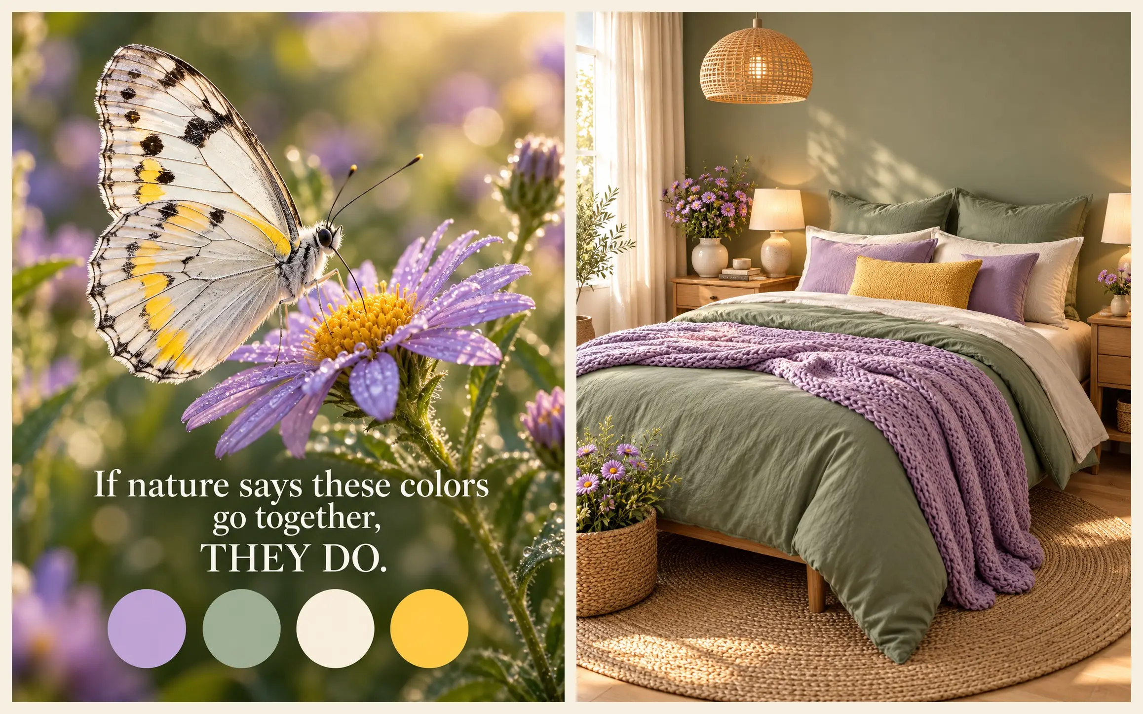
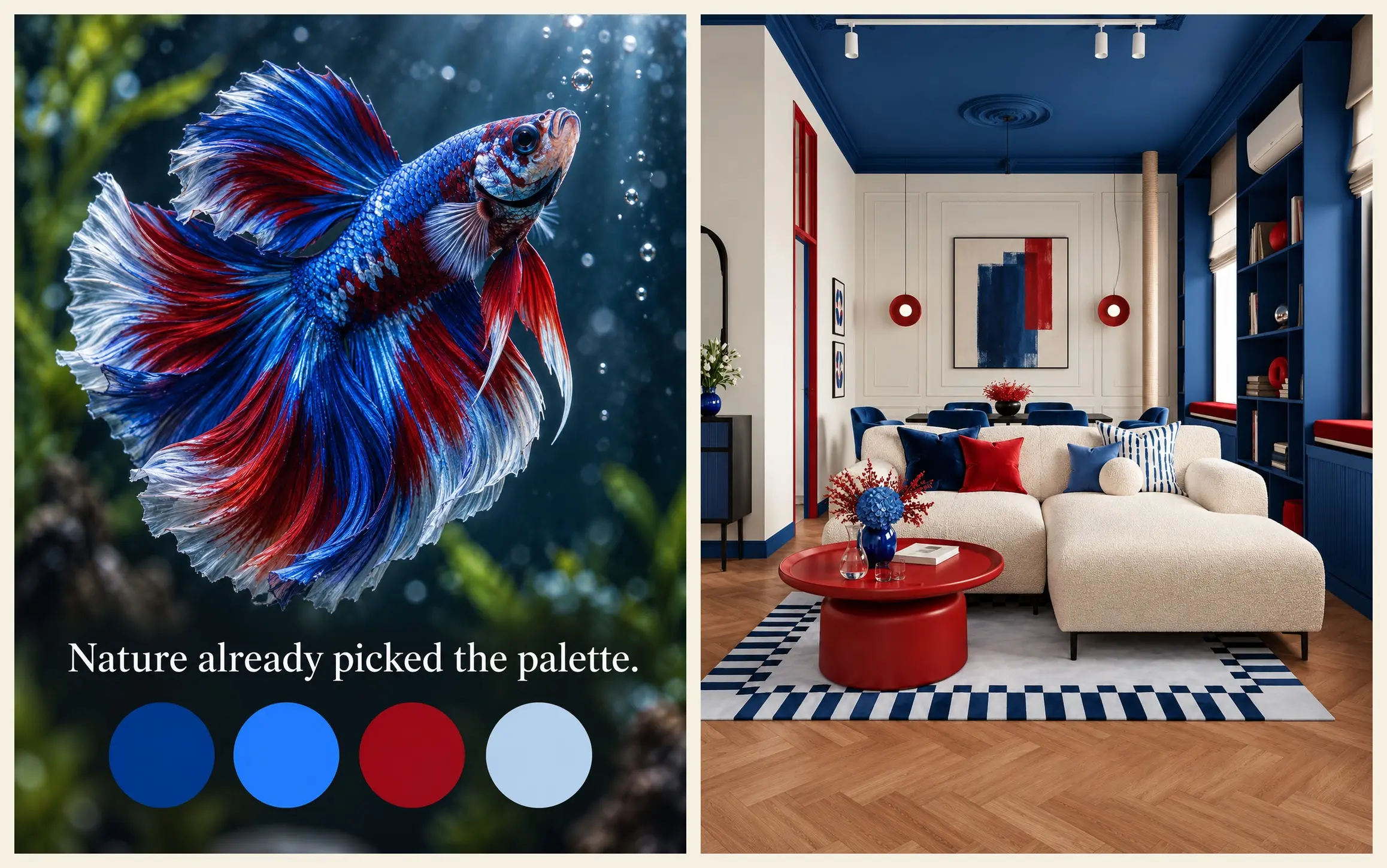
Start from the mood the brand should carry, then find something in nature that already looks that way. Pomegranate reads as deep, warm, and premium. Apricot reads as sunny and approachable. A betta fish reads as bold and high-contrast. A pale butterfly on a lilac aster reads as soft and fresh. A giraffe against a blue sky reads as warm, earthy, and calm.
Use a real photo of the object rather than a stylized illustration, because illustrations add someone else’s color decisions on top of nature’s.
Step 2: Pull Four Colors From the Photo
Open the photo in Canva, Figma, or any editor with an eyedropper, and sample four areas: the largest color, a supporting color, the lightest neutral, and the smallest strong accent. Four is usually enough. Add a fifth only if it has a clear job, like a second accent in a busy scene. The lavender and meadow palettes above use five for exactly that reason.
Step 3: Give Every Color a Role and a Proportion
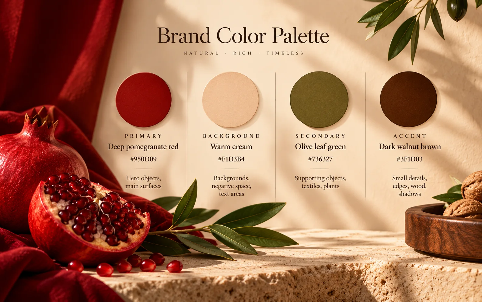
This is the step most guides skip, and it matters more than the colors themselves. Assign each one a role: primary, secondary, background, or accent. Then note roughly how much of the image each should cover, using the object as your guide. In the pomegranate, red dominates, cream supports it, olive frames it, and brown appears only in details.
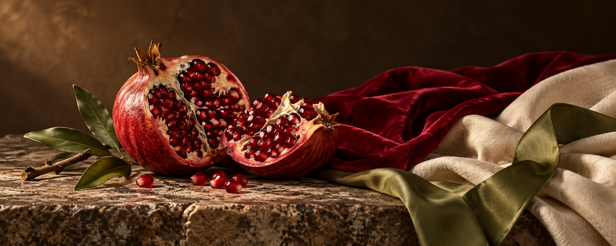
Here is what the pomegranate palette looks like once it is written down. The hex values were sampled with an eyedropper from the pomegranate in the home library image earlier in this guide.
Step 4: Name Each Color Twice
Every color needs a name a model can picture and a code a person can check. The memory color name goes into the prompt. The hex code goes into your brand documentation and into the tools that explicitly support it. The next section explains which tools those are.
Step 5: Test the Palette on Three Real Formats Before You Commit
Generate one image in each format you publish most, for example, a square post, a vertical story, and a wide blog header. If you are unsure which dimensions to use, the social media image sizes guide lists the current specs. A palette that only works in one format is not ready.
How to Use the Palette in Prompts for Each Tool
Tools differ in how reliably they interpret color instructions, and support for precise hex-code control varies by model and product. Here is what each vendor documents, checked in October 2026.
| Tool | What the documentation says | How to pass the palette |
|---|---|---|
| Midjourney | Style references apply the colors, textures, and lighting of an image without copying its objects. | Upload the original nature photo as a style reference and keep the text prompt simple. |
| Gemini 3 Pro Image (Nano Banana Pro) | Accepts up to three images as style references, alongside separate limits for object and character references; edits can adjust color grading. | Describe the color scheme with memory color names; add the nature photo as a style reference. |
| ChatGPT and OpenAI image models | Name colors directly; assign each reference image a role, such as its palette. | Use memory names and roles in the prompt; attach the nature photo and say it is the palette reference. |
| Ideogram | Hex codes are understood only through JSON prompting (Ideogram 4.0 and 4.5) or the custom palette setting (Ideogram 3.0). | Use memory color names, or the custom palette setting on versions that support it. |
| FLUX.2 | Hex codes are supported and work best when each code is tied to a specific object. | Write “sofa in hex,” not “use #950D09 somewhere.” |
Gemini Example: See It in Action
Google’s Nano Banana demo shows how reference images can be combined, edited, and used to carry a visual direction from one image into another.
Sources: Midjourney, Gemini API, OpenAI, Ideogram, and Black Forest Labs. Reference limits and color-control features vary by model and product, so check the current documentation before building a workflow around a specific capability.
Two patterns show up across these tools. First, using the original photo as a reference is often more reliable than relying on color words alone. Midjourney’s documentation is explicit that a style reference carries the look of an image without copying its content, so a peacock feather photo can color a product banner without putting a feather in it. Second, colors work best when they are attached to something. The FLUX.2 documentation shows the difference: hex codes work best when tied to a specific object, while a vague instruction to use a color somewhere may produce inconsistent results. Roles from Step 3 give every color an object to attach to.
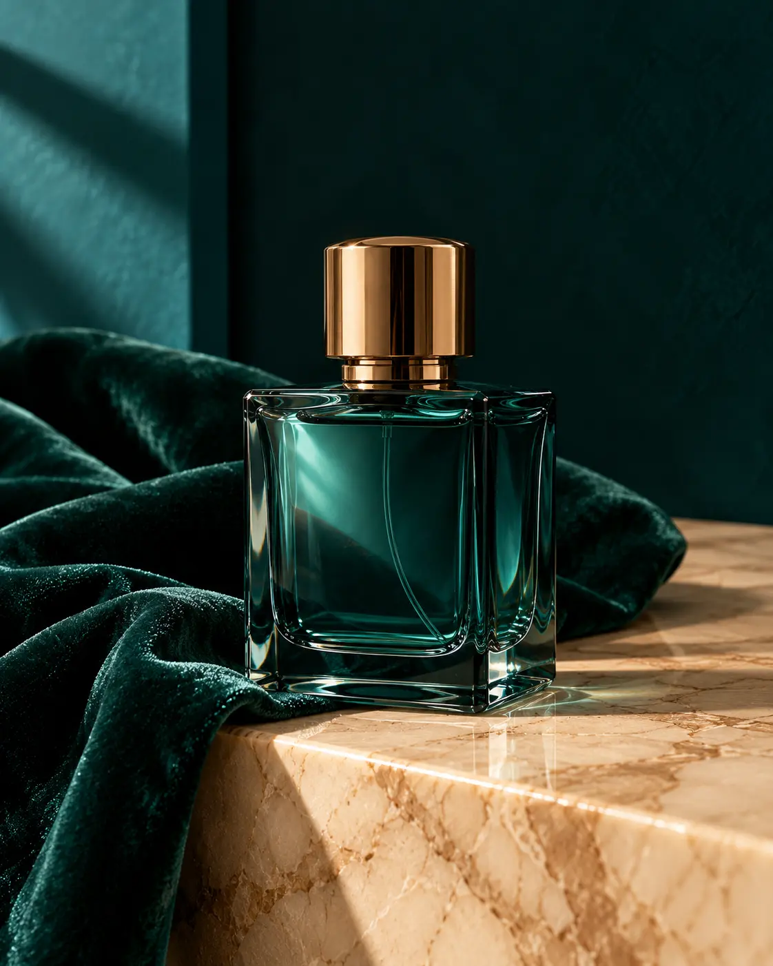
Here is the peacock palette applied to a real marketing task, a perfume product shot:
Instagram product photo, 4:5: a glass perfume bottle on a marble ledge. Deep teal on the bottle and backdrop, dark emerald velvet cloth under the bottle, champagne marble surface, bronze only on the cap. Soft side light, only these four colors plus natural shadows, no text.
How to Keep the Palette From Drifting
A palette that works today will not stay consistent for long unless it lives somewhere outside your head. Write the role table into your brand documentation, the same place you keep voice and positioning. The Brand DNA framework already includes visual identity with hex codes, and this table is what fills that section in a way AI tools can use.
Then turn the table into a short palette block of two or three sentences that you paste into every prompt unchanged. Changing the wording each time can reintroduce the drift you just removed. A block can be as simple as this:
Palette: [primary memory color] as the dominant color on [main object or surface]. [background memory color] for the background and negative space. [secondary memory color] on [supporting object]. [accent memory color] only as a small accent on [detail].
Filled in with the pomegranate palette, it reads:
Palette: Deep pomegranate red as the dominant color on the hero object and fabric backdrop. Warm cream for the background and negative space. Olive leaf green on supporting foliage. Dark walnut brown only as a small accent on tray edges.
The important part is that this palette block stays unchanged. You can then place it at the beginning of different prompts and change only the scene that follows.
Here is the same idea with the giraffe palette inside a complete image prompt:
Palette: Warm camel tan as the dominant color on the wood furniture, floor, and main warm surfaces. Soft cream for the walls, cabinetry, and negative space. Clear sky blue on the sofa and ceiling inset. Rust brown only as a small accent on the chair upholstery and decorative objects.
Scene: Bright natural daylight from the side with soft, realistic shadows. Contemporary dining and living room with a wooden dining table and four chairs in the foreground, a blue upholstered sofa in the background, cream built-in cabinetry, minimal pendant lights above the table, and a large circular sky-blue ceiling inset. Keep camel tan and soft cream visually dominant, keep sky blue secondary, and limit rust brown to small accents. Photorealistic interior photography, natural materials, no people, no text.
When several images belong to one campaign, generate them in the same session where the tool allows it, and keep the nature photo attached as a reference throughout.
Finally, check every output against the swatches before publishing. If one image runs too orange or too dark, an edit is usually faster than a rerun. Gemini’s documentation lists color grading among the changes its editing mode handles, and OpenAI’s guide recommends asking for one change at a time while restating what must stay the same. Tool-specific editing tricks are covered in the Nano Banana Pro guide, the GPT Image 2 guide, and the Midjourney prompts guide.
When a Nature Palette Needs Adjusting
Natural palettes look balanced in a photo, but marketing images often carry text, and text has stricter rules. The W3C’s contrast guideline asks for a contrast ratio of at least 4.5:1 for normal text and 3:1 for large text, and it applies to text inside images too.
The pomegranate palette shows why this matters. Cream text on deep red measures about 6.3:1 and passes. Olive on cream measures about 4.2:1, just short of the 4.5:1 threshold, so it works for a large headline but not for body copy. Deep red against dark brown measures about 1.7:1, which means the two colors nearly merge and should not be used as a text-and-background pair. Run any text and background pair through a free tool such as the WebAIM Contrast Checker before the design goes out. These thresholds apply to text that needs to be read. Logos and purely decorative text are treated differently under WCAG.
It also helps to be clear about what a palette cannot do. It reduces drift, but it does not make different tools produce identical images, because each model interprets light and materials in its own way. Treat the palette as a constraint and review every output before it goes live.
The other adjustment is for brands that already have colors. In that case, keep the brand color as the primary and use the natural object only for the secondary, background, and accent roles. A brand with a fixed navy, for example, could borrow camel and cream from a giraffe to surround it without changing the identity customers already recognize.
The method above works without any specialized software: one photo, four colors, four roles, and one palette block you reuse.
FAQ
Can I use hex codes in AI image prompts?
Black Forest Labs explicitly documents hex-color control for FLUX.2, including the use of exact hex values for brand colors.
Ideogram 4.0 and 4.5 support hex colors through structured JSON prompting. Treat hex codes as a strong recommendation rather than a guarantee: even when a tool supports them, lighting, materials, and surrounding colors can affect how the final color appears. For brand-critical work, use descriptive color names, visual references where possible, and keep the canonical hex values in your brand documentation.
Midjourney, Gemini, and OpenAI document descriptive color language and reference images as ways to guide color. Their documentation does not promise exact pixel-level hex matching. For brand-critical work, use descriptive color names, visual references where possible, and keep the canonical hex values in your brand documentation.
How many colors should an AI image palette have?
Four is a useful starting point for most marketing visuals: a primary color, a secondary color, a background neutral, and a small accent.
Three may be enough for simple graphics, while photographic scenes often benefit from an additional neutral or accent. If you use too many competing colors, the visual hierarchy becomes harder to control, so start with a small palette and add colors only when they serve a clear purpose.
How do I keep the same colors across ChatGPT, Gemini, and Midjourney?
Use the same palette description in every prompt, and reuse the same reference image wherever the tool supports it.
In Midjourney, a Style Reference can influence colors, medium, textures, and lighting across new generations.
Gemini 3 Pro Image supports multiple reference images, including images used as style references.
OpenAI recommends giving each reference image a clear role, such as palette, texture, style, subject, or background.
Exact cross-tool color matching is not guaranteed, so compare each generated image against your original swatches before publishing and adjust when necessary.
Do I need design experience to build a palette this way?
No. A natural object gives you a useful starting point for choosing colors that already feel related.
You still make the final decisions: which colors to keep, what role each one plays, and whether the final design has enough contrast for readable text. An eyedropper tool and a contrast checker are enough to get started.
Start With One Object
Try it now: Take one photo of a pomegranate, apricot, peacock feather, or any natural object that fits your brand. Pull four colors from it, give each one a role, and turn those roles into a fixed palette block. Then generate one banner with the palette block and one without it. Place them side by side. You will quickly see how much easier it is to keep an AI-generated image inside a recognizable visual system when the palette is defined in advance.
Further Reading:
- Brand DNA: The Missing Piece Between Your Brand and AI
- Nano Banana Pro: The Complete Guide for Marketers 2026
- GPT Image 2 for Marketers: How to Finally Get Readable Text in AI Images
- 7 Midjourney V7 Prompts for Marketing Ads, Products, and Social Media
- Social Media Image Sizes in 2026: Official Specs and Practical Templates
- Garbage in, garbage out
About the author
Serafima Osovitny is a Marketing Manager at Nova Express, where she focuses on digital marketing, search visibility, content strategy, and marketing workflows. She writes practical guides that help marketing teams research their audiences, develop strategies, and put their plans into action.
Explore her work at serafima.digital and follow her on X: @OSerafimaA.







Leave a Comment