
You spend hours perfecting an email. Fonts polished, branding sharp. Then you hit send, and in Outlook, it turns into Times New Roman. Your design breaks. Your message loses impact. The culprit? Fonts that don’t work in email. The fix? Email-safe fonts that always render the way you intended.
The problem? Web fonts don’t work in email. But there’s a simple solution: email-safe fonts.
According to Litmus (2024), 43% of U.S. users check email on Gmail, 28% on Outlook, and 19% on Apple Mail. If your fonts break in these clients, you’re losing visibility with most of your audience.
In this guide, you’ll learn:
- What email-safe fonts are and why they matter.
- The 8 best fonts that work everywhere.
- How to choose the right font for your brand tone.
- Why web fonts fail in email (and what to do instead).
- Proven font pairings and accessibility rules.
- A full checklist to test before sending.
No coding. No surprises. Just flawless rendering every time. You’re not alone. Choosing the right font for email isn’t just about style; it’s also about reliability, readability, and brand consistency. In this guide, we’ll break down which email-safe fonts work everywhere and how to use them correctly.
At Nova Express, we handle all the technical complexity so your emails render perfectly in every inbox. Discover how our platform makes font compatibility simple, reliable.
What Are Email-Safe Fonts?
Email-safe fonts are typefaces pre-installed on most operating systems and supported by all major email clients. Unlike web fonts, they don’t require external loading and display consistently across devices.
In the U.S., where Outlook (Windows) and Apple Mail (iOS) dominate, using fonts like Arial or Verdana pre-installed on both platforms is essential for reliable rendering.
✅ Guaranteed compatibility with Gmail, Outlook, and Apple Mail
✅ Instant rendering with no distortions
✅ Professional appearance, no surprises.
The 8 Best Email-Safe Fonts for Flawless Rendering
With Nova Express, you can use these 8 fully compatible fonts.
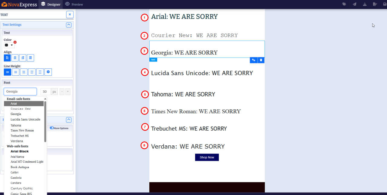

✅ All 8 fonts are fully supported in Gmail, Outlook, Apple Mail, and Android.
How to Choose the Right Font for Your Email: A Style & Tone Guide
Fonts set the tone of your message before a single word is read. Here’s how to match your font to your brand personality:

Pro tip: Use one primary font for body text and one accent font for headings. Using too many styles creates visual noise and hurts readability.
Brands like Apple, Airbnb, and Netflix use clean sans-serif fonts to communicate modernity and trust. While you can’t use Helvetica in email, Arial or Verdana deliver the same minimalist, professional look that resonates with U.S. audiences.
Web Fonts vs. Email-Safe Fonts: What’s the Difference?
Web Fonts: Look great on websites, but Gmail and Outlook block them. Your design breaks.

✅ Email-Safe Fonts: Pre-installed on all devices. Always render correctly.
💡 Bottom line: If your email has to look perfect for 100k subscribers, stick to email-safe fonts.
Smart Font Pairings for Better Visual Hierarchy
Create visual interest with proven combinations:
- Trebuchet MS (heading) + Verdana (body): Modern and readable.
- Georgia (heading) + Arial (body): Classic and clean.
- Tahoma (heading) + Lucida Sans Unicode (body): Tech-savvy and approachable.
These pairs help guide the reader’s eye and reinforce your brand style while remaining 100% email-safe. Learn more about creating high-converting email designs.
Pro tip: Font pairing is critical in welcome emails, where first impressions are formed. To see how top brands use font hierarchy for maximum impact, check out our “Best Welcome Email Examples: Design & Typography Best Practices.
Readability & Accessibility: Best Practices for Email
Even the best font fails if it’s hard to read. Follow these rules:
- Font size:
- Body text: 16–18px (14–16px for formal or data-heavy emails).
- Headings: 22–28px
- Minimum: Never below 14px
- Contrast:
- Use dark text on a light background (or vice versa).
- Ensure high color contrast for readability; aim for a ratio of at least 4.5:1 for body text.
- Line height:
- Use a relative line height of 1.4–1.6 (or 140–160%) for comfortable reading. This ensures proper spacing between lines on all devices, improving readability and accessibility.
- Dark mode:
- Test how your font looks in dark mode.
- Avoid very thin strokes that may disappear on dark backgrounds.
For more email testing strategies, check out the guide on 10 key metrics to analyze your email campaigns.
In the U.S., email accessibility isn’t optional. Under the Americans with Disabilities Act (ADA), your emails should be readable by everyone, including screen reader users. Using 16px+ font size, high contrast, and email-safe fonts helps you stay compliant.
How to Test Fonts Before Sending: Full Checklist
Never send an email without checking how it renders.
📋 Your 5-Minute Pre-Send Font Check
👉 Download the PDF Checklist Now
What If Your Brand Font Isn’t Supported? 3 Proven Methods
If your brand font isn’t on the email-safe list, try these solutions:
- Use images for key elements. Convert headlines, logos, or CTAs into images with descriptive alt text.
- Choose a close alternative: find a supported font that captures your brand’s essence.
- Maintain consistency by using brand colors and imagery to preserve your identity.
Want to dive deeper into brand consistency? Read our post about the power of personalization in email marketing.
Why Nova Express Makes Font Management Effortless
We make font compatibility simple and predictable. With Nova Express, you get:
- ✅ 8 fully supported email-safe fonts
- ✅ No coding required, just select and go
- ✅ Automatic compatibility across all major clients
- ✅ Real-time preview on mobile and desktop
- ✅ Built-in readability checks for accessible emails
Design emails that look perfect and perform flawlessly in every inbox.
Frequently Asked Questions (FAQ): Web-Safe vs. Email-Safe Fonts
Q: What are email-safe fonts?
A: A limited set of fonts (like Arial, Georgia, and Verdana) pre-installed on most devices and guaranteed to render correctly in all major email clients.
Q: What’s the difference between web-safe and email-safe fonts?
A: Web-safe fonts are designed for browsers and websites, while email-safe fonts are specifically chosen to work in the restricted environment of email clients with their unique rendering quirks.
Q: Why do my fonts change to Times New Roman in Outlook?
A: This is a classic font fallback issue. Outlook doesn’t support web fonts and replaces unrecognized fonts with Times New Roman by default. This is just one of many common email marketing mistakes that can hurt your campaigns.
Q: Which font is best for email?
A: For body text, Verdana and Arial are top choices due to excellent screen readability. Among serif fonts, Georgia is the most email-friendly.
Q: Can I use Google Fonts in email?
A: Technically yes, but support is minimal. Gmail and Outlook will ignore them, falling back to standard fonts, which can break your design.
Conclusion: Email-Safe Fonts Made Simple
Email font compatibility doesn’t have to be complicated. By sticking to our proven list of 8 email-safe fonts, implementing proper fallback strategies, and testing across major clients, you’ll ensure your emails look professional and drive results in every inbox.
Key Takeaways:
- Use Arial, Verdana, or Georgia for maximum compatibility.
- Rely on platforms that handle fallbacks automatically so you can focus on your message, not the code.
- Test on mobile devices and in dark mode.
- Prioritize readability over creative flair.
All these fonts are ready to use in our library of 250+ high-converting email templates, each one tested for perfect rendering in Gmail, Outlook, and Apple Mail.
Ready to design emails that look perfect in every inbox? Try Nova Express, no tech headaches, just perfect emails.
About the author
Serafima Osovitny is a content and email marketing specialist at Nova Express. With over 10 years of experience in content creation and a cross-industry perspective, she shares insights about email marketing and e-commerce. In her free time, she enjoys traveling and exploring bookstores. Follow her on Twitter: @OSerafimaA.


Very useful resource!